CRONOMETER

Optimising real-world food logging for efficiency

CRONOMETER

Optimising real-world food logging for efficiency

TYPE

Independent redesign project

ROLE

UX Researcher, UI/UX Designer

DURATION

4 months

TOOLS

Figma, UXTweak, Lovable

CASE STUDY SNAPSHOT

Problem

Repeated food logging required too much searching, interpretation and navigation.

Users

People who log meals regularly and need fast, accurate tracking.

Challenge

Reduce effort without removing useful nutrition detail.

Approach

Interviews, competitor analysis, card sorting, task-flow redesign and usability testing.

Outcome

Perceived ease of use increased from 6.3 to 8.2 out of 10 in low-fidelity testing.

CASE STUDY SNAPSHOT

Problem

Repeated food logging requires too much effort

Users

Users who log meals regularly in need of accurate tracking.

Challenge

Improve speed and clarity without compromising detail.

Approach

Usability testing, card sorting, and task-flow analysis

Outcome

Perceived ease of use increased from 6.3 to 8.2 out of 10 in low-fidelity testing.

PROJECT OVERVIEW

Why consistent logging of food breaks down

Cronometer offers detailed nutrition data, but routine logging can require users to search through dense screens, interpret unfamiliar options and repeat the same actions each day.

Small frictions matter because food logging is a high-frequency habit. When each entry demands extra thought or several steps, consistency becomes harder to maintain.

This project focused on reducing effort in repeated logging while preserving the accuracy and detail users rely on.

PROBLEM STATEMENT

PROBLEM STATEMENT

How might we make support or empower users to efficiently log food items?

How might we make support or empower users to efficiently log food items?

USER INTERVIEWS

Logging food requires more thinking than it should

NUMBER OF USERS

5

NUMBER OF USERS

5

NUMBER OF USERS

5

APP USE PERIOD

4 weeks

APP USE PERIOD

4 weeks

APP USE PERIOD

4 weeks

Participants expected routine logging to feel familiar and efficient. Instead, they encountered dense information, hidden features, inconsistent interaction patterns and too many decisions during everyday tasks.

USER QUOTE

“It was a steep learning curve because the app was packed with info. It was quite overwhelming to be honest.”

Participant no.4

USER QUOTE

“It was a steep learning curve because the app was packed with info. It was quite overwhelming to be honest.”

Participant no.4

KEY INSIGHT

KEY INSIGHT

Participants expected food logging to feel quick and routine, but Cronometer often made them pause, interpret, and work around the interface.

Participants expected food logging to feel quick and routine, but Cronometer often made them pause, interpret, and work around the interface.

ANALYSIS OF COMPETITORS

Patterns among competitors that enable faster logging of food

I reviewed competing nutrition and habit-tracking products to identify patterns that make repeated tasks easier to find, understand and complete.

PATTERN 01

Visible core actions

Editing, copying and reusing entry functions are easy to find

PATTERN 01

Visible core actions

Editing, copying and reusing entry functions are easy to find

PATTERN 04

Flexible serving sizes

Reflect how people naturally describe and portion food.

PATTERN 04

Flexible serving sizes

Reflect how people naturally describe and portion food.

PATTERN 02

Recognition over recall

Recent and frequent foods reduce repeated searching.

PATTERN 02

Recognition over recall

Recent and frequent foods reduce repeated searching.

PATTERN 05

Familiar interactions

Common mobile patterns reduce trial and error.

PATTERN 05

Familiar interactions

Common mobile patterns reduce trial and error.

PATTERN 03

Clear hierarchy

Key information is visible while detail remains available on demand.

PATTERN 03

Clear hierarchy

Key information is visible while detail remains available on demand.

PATTERN 06

Simple language

Labels explain what users can do and what happens next.

PATTERN 06

Simple language

Labels explain what users can do and what happens next.

PATTERN 01

Visible core actions

Editing, copying and reusing entry functions are easy to find

PATTERN 02

Recognition over recall

Recent and frequent foods reduce repeated searching.

PATTERN 03

Clear hierarchy

Key information is visible while detail remains available on demand.

PATTERN 04

Flexible serving sizes

Reflect how people naturally describe and portion food.

PATTERN 05

Familiar interactions

Common mobile patterns reduce trial and error.

PATTERN 06

Simple language

Labels explain what users can do and what happens next.

View full competitor audit →

View full competitor audit →

INFORMATION ARCHITECTURE

Users prioritise logging over creation

While sketching the primary Add flow, I needed clearer evidence about which actions users expected to find there. A card sort with seven participants showed that logging actions were consistently prioritised over creation tasks.

DESIGN IMPLICATION

DESIGN IMPLICATION

Card sorting showed that the primary “+” menu should prioritise logging actions, while creation actions remain available as secondary options.

Card sorting showed that the primary “+” menu should prioritise logging actions, while creation actions remain available as secondary options.

IDEATION AND SKETCHING

Translating user needs into sketches and wireframes

I translated the interview findings, competitor patterns and card-sort results into four principles, then developed the strongest ideas into low-fidelity wireframes for usability testing.

DESIGN PRINCIPLE 01

Prioritise repeated actions

Surface everyday logging before lower-frequency creation tasks.

DESIGN PRINCIPLE 03

Reduce decision load

Provide useful defaults and reveal additional detail only when needed.

DESIGN PRINCIPLE 02

Support recognition over recall

Show recent and frequently logged foods before asking users to search again.

DESIGN PRINCIPLE 04

Keep actions predictable

Group related actions and use familiar interaction patterns consistently.

DESIGN PRINCIPLE 01

Prioritise repeated actions

Surface everyday logging before lower-frequency creation tasks.

DESIGN PRINCIPLE 02

Support recognition over recall

Show recent and frequently logged foods before asking users to search again.

DESIGN PRINCIPLE 03

Reduce decision load

Provide useful defaults and reveal additional detail only when needed.

DESIGN PRINCIPLE 04

Keep actions predictable

Group related actions and use familiar interaction patterns consistently.

During sketching, I focused on patterns that would reduce decision fatigue, improve discoverability of key actions, and support faster task completion without relying on memory or workarounds.

I then translated these into low-fidelity sketches to explore alternative layouts, interaction patterns, and information hierarchies before committing to high-fidelity designs.

View the full ideation process →

WIREFRAMES AND PROTOTYPES

From concepts to a testable experience

These wireframes focused on testing:

  • a meal-first logging flow as an initial approach,

  • a quick entry feature for faster manual logging,

  • a contextual toolbar for high-frequency actions like move, copy, and delete,

  • a restructured search experience for faster access to recent and frequent foods

  • simplified flows for creating custom foods, meals, and recipes.

These concepts were connected into a low-fidelity prototype and tested to identify friction points before moving into high-fidelity designs.

Meal-first structure tested as the initial model

Quick Entry explored as a shortcut for manual logging

Search and contextual actions redesigned for repeated tasks

Meal-first structure tested as the initial model

Quick Entry explored as a shortcut for manual logging

Search and contextual actions redesigned for repeated tasks

1. Meal-first structure tested as the initial model

2. Quick Entry explored as a shortcut for manual logging

3. Search and contextual actions redesigned for repeated tasks

Video walkthrough of low fidelity prototype

Video walkthrough of low fidelity prototype

USABILITY TESTING

The prototype felt easier overall, but friction remained in key interactions

The same five participants who completed the exploratory interviews returned to test the low-fidelity prototype. Because all five had already used Cronometer for one month, I could compare their ratings of the original app and the prototype.

Average perceived ease-of use · Scale 1 – 10

Average perceived ease-of use · Scale 1 – 10

ORIGINAL APP

6.3

ORIGINAL APP

6.3

LO-FI PROTOTYPE

8.2

LO-FI PROTOTYPE

8.2

All five participants rated the low fidelity prototype higher, suggesting that the redesigned flows made everyday logging feel clearer and more manageable..

Although perceived ease improved for every participant, testing still revealed friction in certain interactions:

= participant affected ,

= not affected

(total number =5)

FINDING O1

The proposed Quick Entry feature did not feel quick

The proposed Quick Entry feature did not feel quick

I introduced a separate Quick Entry feature after identifying similar shortcuts in competitor apps. During testing, all five participants found it unintuitive, too manual and difficult to locate.

“The look and feel of it seems more complicated than the normal flow… A lot of things to fill in..”

“The look and feel of it seems more complicated than the normal flow… A lot of things to fill in..”

EXPLORED REDESIGN

Remove the shortcut and simplify the core flow

Rather than refine a separate feature that duplicated manual entry, I removed the Quick Entry feature and reduced effort within the main Add Food flow. Essential fields were prioritised, while detailed nutrition information was placed behind progressive disclosure.
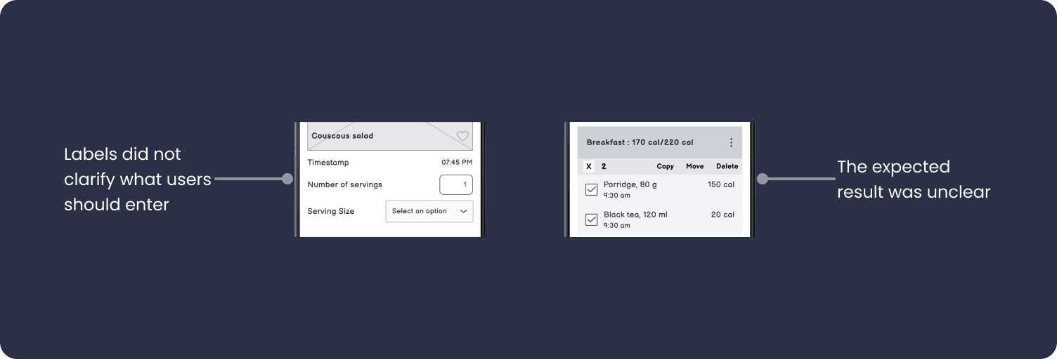
1. One primary flow instead of a separate shortcut

2. Essential fields appear first

3. Nutrition details remain available on demand

One primary flow instead of a separate shortcut

Nutrition details remain available on demand

Essential fields appear first

One primary flow instead of a separate shortcut

Nutrition details remain available on demand

Essential fields appear first

FINDING O2

Terminology did not match users’ mental models

Certain terms did not align with how users think about food, causing hesitation and need to interpret at key input steps.

“the text… the wording is vague and it kind of makes you… it confuses you basically”

“the text… the wording is vague and it kind of makes you… it confuses you basically”

EXPLORED REDESIGN

Make language explicit and consistent

I replaced vague terms with task-specific microcopy and used the same language across related steps, reducing the need to interpret what each field or action meant.

FINDING O3

Users wanted familiar foods surfaced first

Participants wanted recent and frequently logged foods to appear before broader search results. Familiar entries helped them recognise what they needed instead of recalling exact names or repeating routine steps.

“I would not need to search for it if it’s already part of my repertoire.”

“I would not need to search for it if it’s already part of my repertoire.”

1. Familiar foods were not prioritised

2. Users still had to search or make an early contextual choice

3. Routine entries were difficult to recognise at a glance

Familiar foods were not prioritised

Users still had to search or make an early contextual choice

Routine entries were difficult to recognise at a glance

EXPLORED REDESIGN

Make food the starting point for logging

I replaced the meal-first sequence with a food-first flow. Contextually relevant recent and frequent foods appear first, while meal placement and additional details follow after selection.

1. Broader search is still available

2. Recent and frequent foods reflect the current meal context

3. Previous searches remain accessible

Broader search is still available

Previous searches remain accessible

Recent and frequent foods reflect the current meal context

Broader search is still available

Previous searches remain accessible

Recent and frequent foods reflect the current meal context

FINDING O4

The contextual action bar did not match users’ expectations

The contextual action bar did not match users’ expectations

Although follow-up actions were surfaced contextually in the low-fidelity prototype, participants found the interface confusing or unlike interaction patterns they were familiar with.

One participant also questioned what would happen after selecting actions such as Copy or Move.

“Assuming I’ve already copied something… What if I want to paste to breakfast? Do we have yet another option here?”

“Assuming I’ve already copied something… What if I want to paste to breakfast? Do we have yet another option here?”

EXPLORED REDESIGN

Make the contextual action state more familiar and easier to interpret

I retained long-press as the entry point, but refined the selected state and contextual toolbar to create clearer hierarchy and stronger feedback about what was selected and which actions were available.

I also developed explicit destination and confirmation states for Move, responding to the uncertainty raised during testing.

1. Selected state is more visually explicit

2. Related actions are grouped within a clearer

3. Confirmation communicates what changed

Selected state is more visually explicit

Related actions are grouped within a clearer toolbar

Confirmation communicates what changed

Selected state is more visually explicit

Related actions are grouped within a clearer toolbar

Confirmation communicates what changed

ACCESSIBILITY REFINEMENTS

Reducing competition for attention

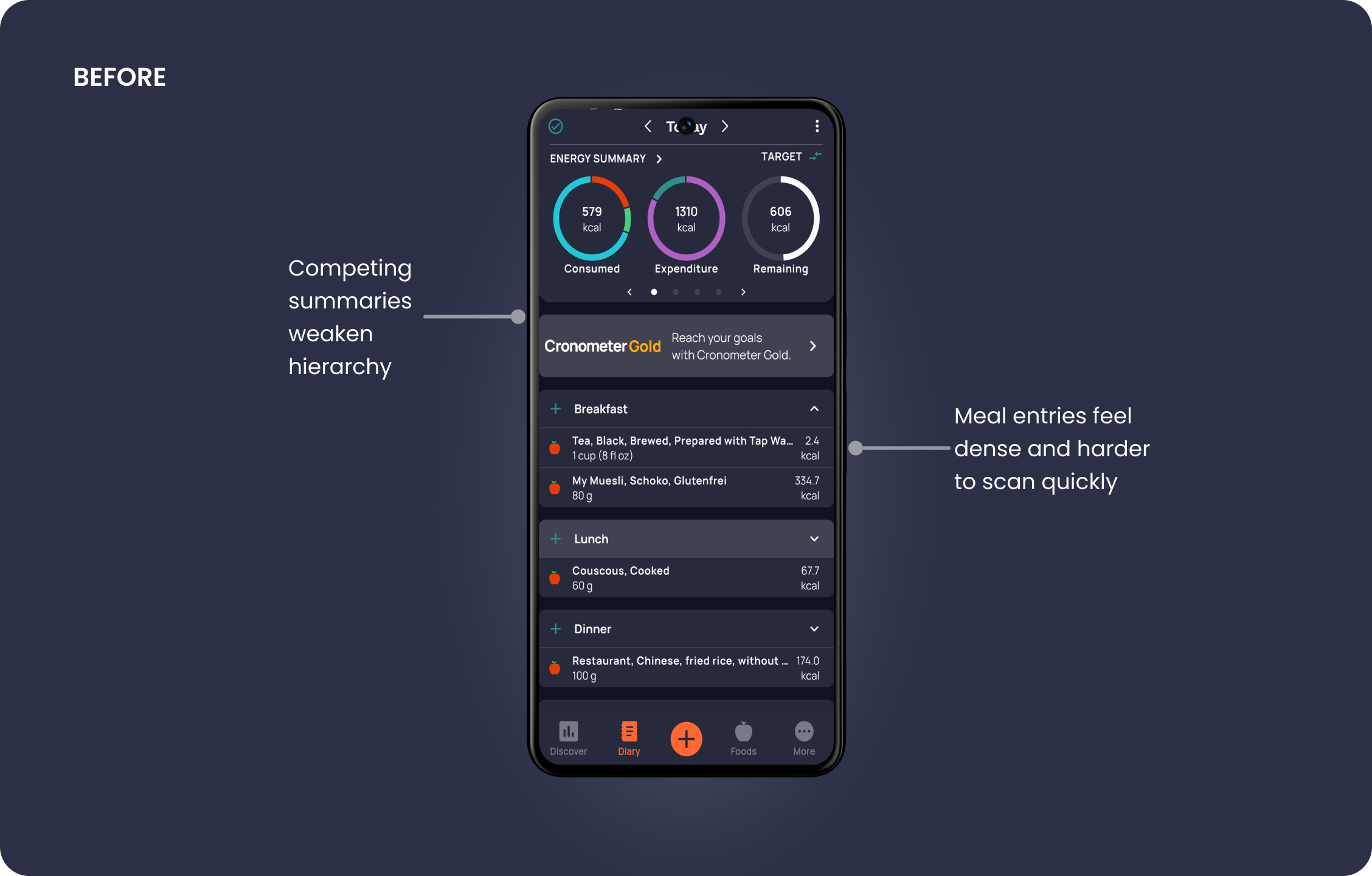
Beyond issues identified in low-fidelity testing, I refined the diary using findings from the initial app review and accessibility assessment. I consolidated the energy summary, removed visual competition, and strengthened the hierarchy of meals and entries.
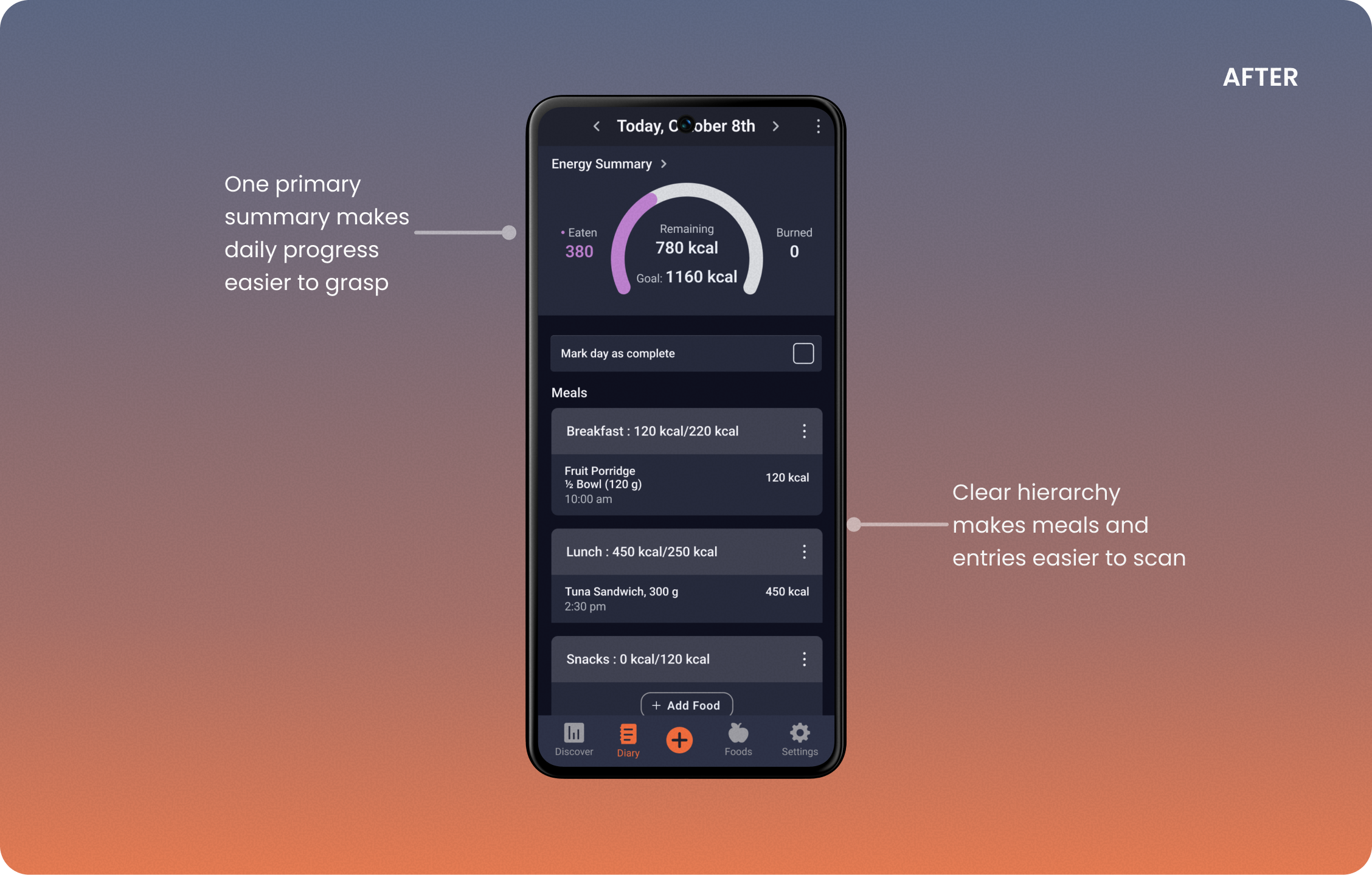
After
Before
After
Before

Interactive Prototype

To demonstrate how the redesign improves efficiency in everyday use, I created an interactive prototype focused on key high-frequency interactions.

The prototype focuses on three core interaction flows:

  • Logging frequently used foods with minimal input

  • Editing serving sizes with contextual defaults

  • Using contextual actions to manage existing entries

The high-fidelity mockups were designed in Figma, with the design system carried over into Lovable to build a code-driven interactive prototype. Interactions were implemented within Lovable to simulate how these flows behave in a more realistic environment.

1. Familiar foods surfaced first

2. Explicit destinations and feedback

3. Context follows food selection

Video walkthrough of high fidelity mockups

Interactive Prototype

To demonstrate how the redesign improves efficiency in everyday use, I created an interactive prototype focused on key high-frequency interactions.

The prototype focuses on three core interaction flows:

  • Logging frequently used foods with minimal input

  • Editing serving sizes with contextual defaults

  • Using contextual actions to manage existing entries

The high-fidelity mockups were designed in Figma, with the design system carried over into Lovable to build a code-driven interactive prototype. Interactions were implemented within Lovable to simulate how these flows behave in a more realistic environment.

Interactive Prototype

To demonstrate the redesign as a connected experience, I translated the high-fidelity screens into a code-driven interactive prototype in Lovable to simulate how these flows behave in a more realistic environment.

The prototype focuses on three core interaction flows:

  • Logging frequently used foods with minimal input

  • Editing serving sizes with contextual defaults

  • Using contextual actions to manage existing entries.

Familiar foods surfaced first

Explicit destinations and feedback

Context follows food selection

Familiar foods surfaced first

Explicit destinations and feedback

Context follows food selection

Video walkthrough of high fidelity mockups

CLOSING THOUGHTS

What worked, what I’d revisit, and what’s next

This project showed that improving efficiency was less about adding shortcuts and more about changing the order of decisions. Moving from a meal-first to a food-first flow, surfacing familiar foods, and clarifying follow-up actions made routine logging more direct.

The later high-fidelity iterations were not retested. A future round would need to validate these patterns across a broader range of users, routines, and eating schedules.


NEXT 01

Create without interrupting the active flow

When a food is missing, allow users to create it inline and return to the search they were completing.


NEXT 02

Modify familiar meals instead of starting again

Allow users to edit an existing meal, combine it with other foods, and save the result as a new version.


NEXT 03

Make meal categories more flexible


Explore custom meal categories and allow users to continue without assigning one when standard labels do not fit.


This project showed that improving efficiency was less about adding shortcuts and more about changing the order of decisions. Moving from a meal-first to a food-first flow, surfacing familiar foods, and clarifying follow-up actions made routine logging more direct.

The later high-fidelity iterations were not retested. A future round would need to validate these patterns across a broader range of users, routines, and eating schedules.


NEXT 01

Create without interrupting the active flow

When a food is missing, allow users to create it inline and return to the search they were completing.


NEXT 02

Modify familiar meals instead of starting again

Allow users to edit an existing meal, combine it with other foods, and save the result as a new version.


NEXT 03

Make meal categories more flexible


Explore custom meal categories and allow users to continue without assigning one when standard labels do not fit.


This project showed that improving efficiency was less about adding shortcuts and more about changing the order of decisions. Moving from a meal-first to a food-first flow, surfacing familiar foods, and clarifying follow-up actions made routine logging more direct.

The later high-fidelity iterations were not retested. A future round would need to validate these patterns across a broader range of users, routines, and eating schedules.


NEXT 01

Create without interrupting the active flow

When a food is missing, allow users to create it inline and return to the search they were completing.


NEXT 02

Modify familiar meals instead of starting again

Allow users to edit an existing meal, combine it with other foods, and save the result as a new version.


NEXT 03

Make meal categories more flexible


Explore custom meal categories and allow users to continue without assigning one when standard labels do not fit.


·

© 2026 REVATHY JAYAN

·

Need help untangling complexity?
Lets talk :)

·

© 2026 REVATHY JAYAN

·

© 2026 REVATHY JAYAN