
MANAGEMYPAIN
Simplifying pain tracking for first-time neurodivergent users.
TYPE
Independent redesign project
ROLE
UX Researcher, UI/UX Designer
YEAR
2024-2025
TOOLS
Figma
PROJECT OVERVIEW
The challenge of tracking pain clearly
INITIAL PROBLEM STATEMENT
How might we make tracking and managing chronic pain in ManageMyPain more accessible for neurodivergent users?
USER INTERVIEWS
Users felt lost before they even began.
When synthesizing the interview data, a clear pattern emerged: the highest friction and emotional overwhelm occurred right at the start of the journey:during onboarding.
All participants described feeling lost, overloaded, or unsure of what was expected before they could begin tracking their pain.
KEY INSIGHT
The biggest friction was not pain tracking as a whole, but the first-time entry experience, where users felt overwhelmed before they could even begin.
This finding led me to reframe my initial problem statement.
REFRAMED PROBLEM STATEMENT
How might we make the first-time user experience of ManageMyPain less cognitively overwhelming for users who are neurodivergent?
This reframing narrowed the project from improving the whole app to focusing on the moment with the highest impact: a user’s first pain entry.
ANALYSIS OF COMPETITORS
What the competitors got right about reducing overwhelm
I reviewed direct and indirect competitors to understand how health, tracking, and habit-forming apps reduce effort during complex tasks.
IDEATION AND SKETCHING
Exploring ideas through sketches and wireframes
I translated the research insights into four design principles that guided the first-entry redesign:
While sketching, I primarily focused on different design patterns to reduce cognitive load and ensure a less overwhelming first-time flow for neurodivergent users, such as
Progressive disclosure
Strong visual hierarchy
Clear navigation
WIREFRAMES AND PROTOTYPES
From concepts to a testable experience
The most promising sketch concepts were translated into low-fidelity wireframes, using them to create a lo-fi prototype for usability testing. At this stage, I focused on structure rather than visual polish: could a guided flow make first-time pain logging feel less overwhelming?

USABILITY TESTING
Users hesitated when the app made them think
= participant affected ,
= not affected
(total number =5)
Participants desired the flexibility to express pain in ways that aligned with their individual experiences. This need first emerged during interviews with users of the existing app and resurfaced during lo-fi testing.
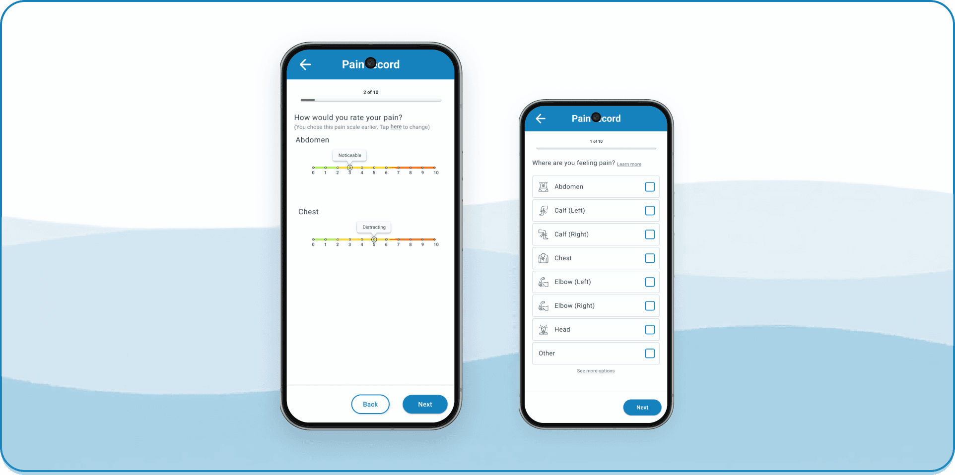
I introduced multiple pain scale options so users could choose a method that felt more intuitive, familiar, and personally meaningful.
Unclear or assumptive instructions caused hesitation and second-guessing at key decision points, instead of supporting quick input.

I corrected unclear labels and instructions to communicate clearly what users were expected to enter. The goal was to reduce interpretation effort and make the flow more self-explanatory.

The way the system asked users to log pain duration did not reflect how participants naturally communicated and thought about their experiences.
I restructured duration input to better reflect how participants described their pain in conversation. Rather than relying on an abstract system model, the redesigned flow supports more natural and interpretable time entry.
Users were sometimes unsure how to move forward, go back, or leave a step. This uncertainty weakened confidence in the flow and made the experience feel more effortful than it needed to be.
I introduced clearer navigation cues, including more explicit forward and backward actions, so users could understand where they were in the flow and what would happen next.
Participants wanted a clearer sense of what the experience would involve and what kind of information they would be asked to provide before beginning to log their symptoms.
I added upfront guidance so users know what to expect before committing to logging their symptoms. By previewing what to expect, the flow feels less abrupt and more supportive for first-time users.
The first-entry flow needed clearer guidance, lower upfront effort, and more forgiving interaction patterns to support users during a cognitively demanding health task.
ACCESSIBILITY REFINEMENTS
Making dense health data easier to read and act on
Alongside usability testing, I reviewed the original app for accessibility and heuristic issues. These smaller refinements helped make the hi-fi mockups easier to scan, understand, and interact with.


The accessibility refinements were incorporated into the final hi-fidelity flow. This walkthrough shows how the redesigned first-entry experience guides users before logging, supports personalisation, and keeps each step easier to scan.